Opaque and Transparent Lead-Free Enamels by W.G BALL
Review by Rebecca Di Filippo
In my career I have mostly worked with lead-based enamels as I had the prejudice that lead-free enamels were less beautiful. After trying the enamels by W.G. Ball, I had to change my mind. These enamels are excellent, especially transparent colours, which are more resistant to prolonged firing. The enamels of W.G. Balls have good compatibility with other brands, including lead-based brands. They work very well with Soyer and Schauer, and interesting effects can be achieved by playing with over-firing.
The ideal temperature for their use is 800/815 ◦C. I think the strength of these enamels is their incredible acid resistance and their compactness which makes them suitable for stoning with carborundum stone (they have very few porosities under the surface) and therefore they are perfect for champleve ́ and cloisonne ́ techniques.
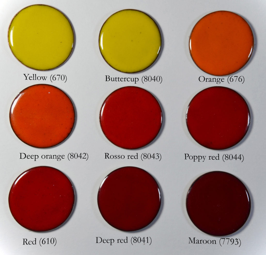
All colours have the same melting point. The only ones that are slightly softer are the following: Maroon 7793, Mint green 8037, Deep red 8041, Butter- cup 8040, Deep orange 8042, Ivory 623, Poppy red 8044, Red 610, Orange 676, Caramel 8038 and Yellow 670. Reds and oranges (fig. 3) are softer than other colours and tend to have black edges when used on copper. I therefore recommend applying at least 2 or 3 layers or using them on a flux base. Among all, I recommend the Rosso red 8043 for its resistance, Poppy red 8044, Maroon 7793 and Orange 676 for their lively tones.
I find the Foundation white 7312 and the Forest green 678 (fig. 4) to be particularly hard. While all the other colours level themselves quite well during firing, I have always needed to stone these two with carborundum to uniform the surface. Lapping the piece is preferable to raising the temperature excessively or prolonging the time in the oven.
Due to the hardness and the slightly opalescent tone that characterises the Foundation white 7312, this enamel is ideal as base for enamel painting. This white together with all the other whites by W.G. Ball (Cream white 646 and Blue white 7582) can be used directly on copper because it reacts very well to the oxidation of the metal and hardly creates green halos on the edges.


Other colours like the Foundation white 7312 have a slight opalescent tone. It is like over- firing an opal enamel: you will obtain a more opaque enamel, but not completely opaque. I also fell in love with these colours because of their fantastic pastel tints: Ivory 623, Pale blue 644, Grey 693, Mint green 8037 and Pale green 7792 (fig. 6).
Another enamel that I recommend is the Blue black 600, a real ”must have”, which compared to Brown black 7575 looks much shinier, colder and more in- tense. You can’t live without it. It’s also suitable as a base for a grisaille made with onglaze. Chestnut brown 671 on the other hand has a very warm hue and when applied in thin layers gives the impression of being slightly transparent, especially on the edges. This detail gives depth to it.
The Grass green 686 (fig. 4) is the only colour which slightly disappointed me. It has slightly darker grains, making it not very uniform. It’s a shame be- cause the shade of this glaze is beautiful.
All pinks are very intense, with the exception of Pale pink 7990, which has a very delicate tint. If you want to use pinks on silver I recommend applying them on a flux base and in the case of champleve ́ put some flux even on the vertical edges. The contact with silver leads these enamels to have slightly yellow edges. While opaque pinks have this defect when touching silver, transparent ones are always impeccable. With the exception of Light dusky rose 7509, which I recommend using on flux, all the others can be used directly on 999 and 925 silver without any reaction. You don’t need flux or particular attention to obtain excellent pink with these colours. They are also very easy to fire (fig. 7).
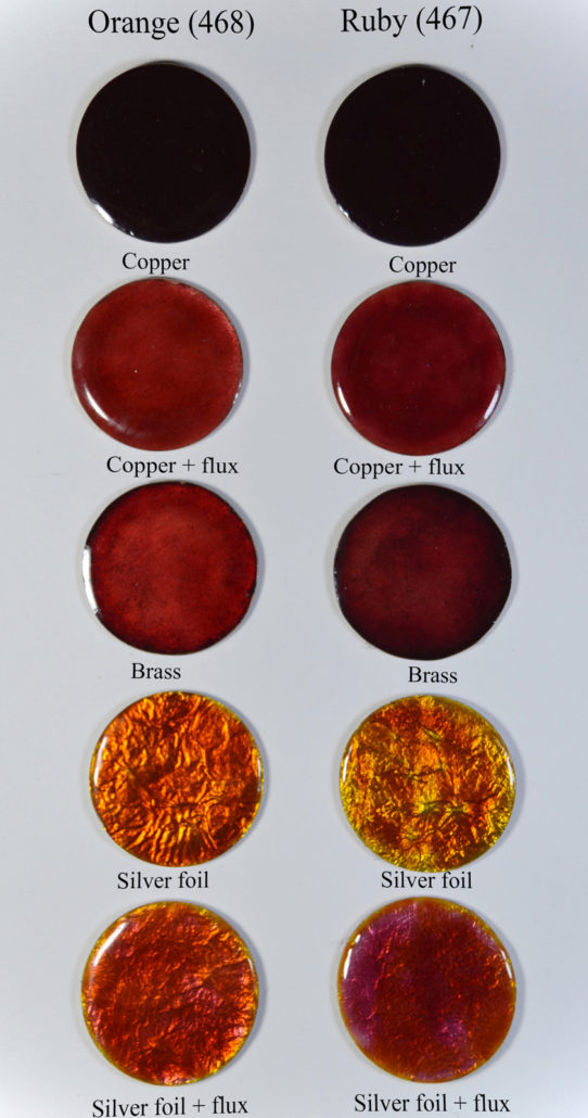
The fluxes I prefer are Clear flux 477 for copper (on silver it has a very nice yellowish tint, beautiful but not ideal for working) and Flux copper tint 7438, perfect for both copper and silver (fig. 8). It can happen that when firing a flux on silver it initially appear yellowish, especially if applied in a thick layer. Only some fluxes have this characteristic (fig. 8) while others with a second firing become completely transparent. Hard silver flux 7266 is the most suitable to isolate silver from Ruby 467 so that it doesn’t become yellow. Despite this, I find it too hard. Personally I can’t use it to enamel, I prefer to replace it with Flux copper tint 7438. In fact I used this last in the sampling of Ruby 467 and Orange 468 both for copper and for silver. With these two colours it is essential to put the flux when working on cop- per, while if you prefer to work directly on the metal and maybe on engravings I recommend trying a brass alloy between 85% and 95% copper and the remaining part of zinc. The one used for the sample is 95 Cu -5 Zn (fig. 9). The yellow hue that silver 999 gives to Ruby 467 and Orange 468 is not muddy, but very bright and intense. I fell in love with it.
Similar shades are found in the range of amber and brown enamels (fig. 10). It is almost impossible to choose one because they are all beautiful, but I believe that Light gold 470 and Copper brown 425 are the best on silver, while Dark gold 7225 is the best on copper (I recommend a rather strong firing for an amazing result). Copper brown 425 and Light brown 403 if applied directly on copper appear very dark. Whenever a colour appears this dark, it is possible to apply it on a flux base with a thin layer to lighten it a little.
Be careful with very light colours: both among the yellows (Hint of Yellow 7529 and Yellow 7453, fig. 10) and the greens (fig. 11) there are pale colours that on copper appear completely trans- parent, while on silver they are beautiful and delicate. For greens, I recommend the Ultra pale green 7516 because it maintains a good result both on cop- per and silver.
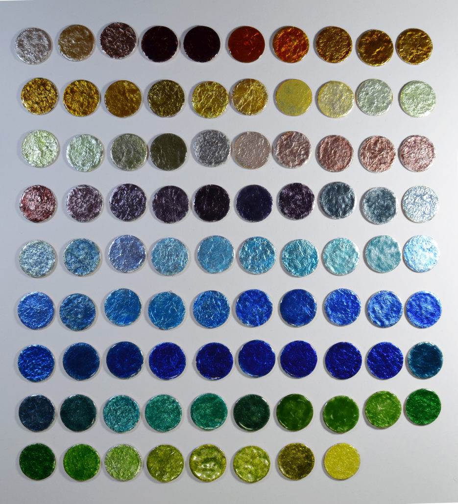
I find these enamels to be too covering: Green 7513, Olive green 7488 and Misty green 7489 (fig. 12). They are not suitable for use on engravings, but given the similar hue they can be good substitutes for the Grass green 686. All the samples were made with “washed” colours, i.e. I used the bigger grains of the enamel. I applied them wet in two or three layers directly on copper and directly on pure silver foil. Based on my experience with these enamels in personal projects, I can say that you can achieve amazing result without washing them, especially on silver.
Looking at the photos you will notice that some enamels with cold colours (like light blue (fig. 13) and light green (fig. 11) sometimes have pinkish edges. This happens because a smaller quantity of enamel is applied on the edges and therefore the pink colour of copper is more visible. This does not happen if the same colours are used in the champleve ́ or cloisonne ́ techniques.


The Sample Set offered by W.G. Ball allows you to buy a small quantity of each colour available, and discover the colours that are the best for you. My Must-have enamels are:
- Medium dusky pink 7484
- Dark gold 7225
- Mint green 8037
- Pale blue 7273
- Blue black 600
- Foundation white 7312
- Sandstone 7518
- Peacock blue 7520
- Teal 7789
- Orange 468

Enamelling Starter Kits

Enamelling Starter Kits